


Creating an Atmosphere of Sophistication
Part 2

Issue 25 Winter 2000
View Contents ▸
Prior to Synrg Media's 'Halina' images, 2 other biltboard campaigns ran in Belfast. Katy Radford talked to the originator of both, Patrick Ryan, currently of Kerr and Ryan Advertising and discovered plus ça change with regards to how women are comodified within the advertising industry.
KR: Talk to me about your involvement in the campaign, what was your brief?
PR: ACS came to us to handle the North of lreland, they had an agency in the South. lt was a pretty straightforward brief - the task was just to re- establish and reposition ACS in the Northern Market and break down some of the taboos about cosmetic surgery. This whole campaign was preceded by one that had a very different tone and style, it was very simple mono shots with the line 'For a more confident life just follow the dotted line'. A 'Cut on the dotted line' approach. The client specifically wanted to stir up the pot a little bit with this campaign, they felt that NI was ready for a more aggressive approach. They had a situation where down south they had generated tons of free copy, an enormous amount of publicity with the images they had used there with the grandmother, Halina, that you can now see in Belfast. And they had wanted to do that up here. But we were against using that strategy up here because we didn't think it was right to feature the MD for the company. We wanted to develop a brand and image for the company that wasn't based around any individual who happened to be in the company at that particular time. We felt it was more short sighted and that it wouldn't do anything for the brand in the long term.
KR: Talk to me first about the various images that you did choose.
PR: I'll take you through each of them. Humour was important. This one, she's got a beautiful clear face, brilliant complexion and She's just a very attractive, soft face. lt is actually about hyperhydrosis so the headline 'When I get damp I want to enjoy it' is just playing up on the fact that she doesn't want to get into stressful situations, She doesn't want to sweat excessively. The copy is nice and simple on that procedure.
KR: What about this bottom over here?
PR: A confidence thing. 'Admit it, it was my personality that attracted you.' With a close up of the rear. lt's a knowing thing. lf you read the copy 'Life s unfair, you ve brains, personality and what's the first thing guys notice? Fortunately there's ACS.', So it's written in a tone of voice that understands that it's ridiculous that men focus in on these superficial features, but in today's world women can turn that around and play men at their own game.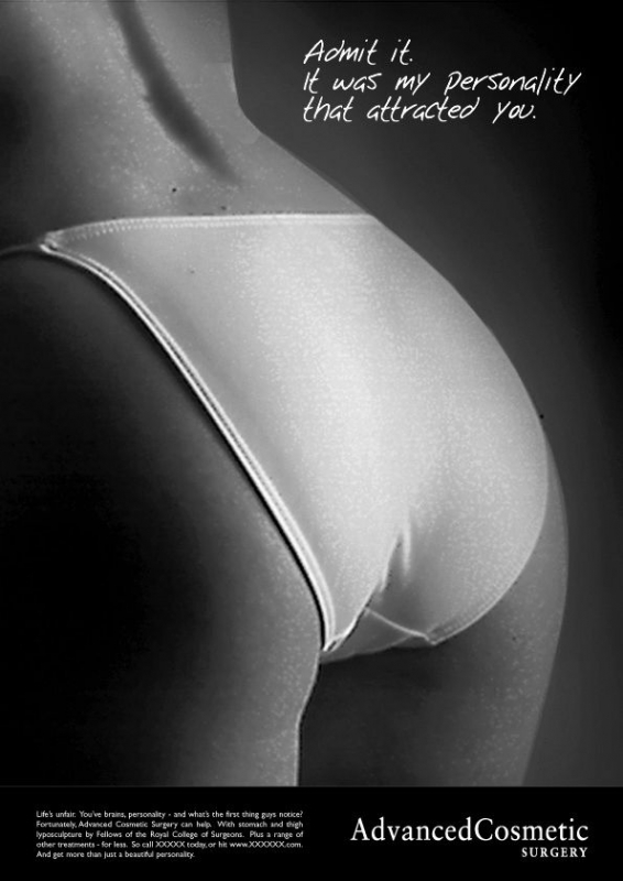
KR: But how do they do that in this advert? By buying into the ad?
PR: Yes.
KR: So how's that turning it around? What you're actually saying is that women are buying into it wholesale.
PR: This one is about saying 'Aren't men thick'.
KR: But aren't I going to be thicker still by spending two thousand pounds to have my bottom changed to appease them?
PR: That depends on the reason you do it. From speaking to the client, many Seem to want to do it on the basis of confidence. This one we're using a cropped shot from a colour one. It's about lip enhancement. 'If in doubt, pout'. This one again is also about a girl-power confidence thing. It's about empowerment - if in doubt - pout. A slightly harder look and it's not exactly what we're going for. It's a slightly more quizzical look that we're going for. (Tattoo removal image).
KR: Quizzical being?
PR: We wanted a more relaxed, blasé feel to her and she gave it to us in the shot.
KR: It reads 'Vanity Isn't Always a Virtue'.
PR: She's almost got a religious feel. When you see the colour shots, she's got something almost religious in her look.
KR: Religious. What do you mean by that? How does that come across?
PR: I think in the way she's throwing her eyes up to heaven there's a sort of resigned look to her. We're trying to bring confidence into all of these shots. Here's a young, confident woman and she's happy with herself and the way she looks. You see in some of the full on shots, in the way the light shines down on her face, in the context of the shot there are these divine tones. we're not trying to make a direct reference to God.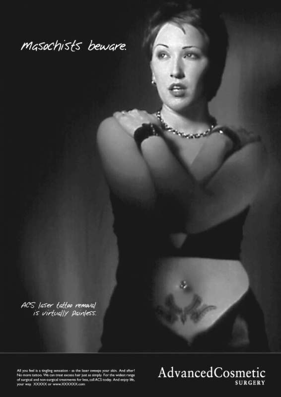
KR: What about the rather harsh 'We also reshape noses' look, what were you trying to achieve here?
PR: I don't think personally she is particularly beautiful, we wanted someone who was more vampish in this particular one when we knew that it was going to be featured on the 48 sheets, we wanted an almost overly aggressive confident empowered tone that would be much more combative.
KR: What is she combating?
PR: I think she's partly combating men. What we were saying here was we wanted to show a woman who could take men or leave them, who could play the game.
KR: In this image, you have cut the face in two, why have you done this?
PR: Purely as a treatment and to try and take the identical image used here - to make lt look different. It was purely a technical device to make it look like two different shots.
KR: I wonder if we could consider issues about authenticity here? Of the three women you used, have any had cosmetic surgery?
PR: She ('We also reshape noses') has had breast enhancement. She had them enlarged.
KR: Did you choose her for that reason?
PR: No, we chose her because she had the right look.
KR: Which is what?
PR: What we needed in this shot was someone with ample breasts. I'm not sure what size she is. But we were looking for someone with a good figure for the actual job we're pushing here which was breast enhancement.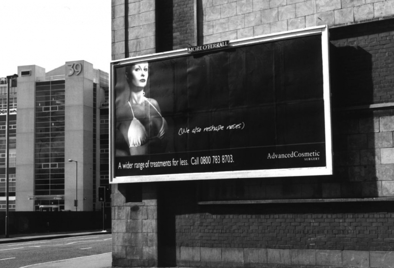
KR: Did it iust come out in the conversation 'Oh I've had my breasts done, by the way.' How did you establish this with her?
PR: We asked her. But had she not had breast enhancement, we would not have had any qualms about using her for the shot. It wasn't a prerequisite, it was about an image - that's what all advertising is about.
KR: I see her as quite a masculine figure. I wondered was it aimed at men who might want 'corrective' surgery in some shape or form? It's not a feminine look.
PR: No it's not. That shot, the way the face turned out is probably not ideal. We as an agency were not particularly happy with the way the facial look turned out. We were wanting someone vampish and she did everything right on the day, but I don't like the harshness in her face, that wasn't something we were striving for. You know, this one is quite obviously humorous. 'We also reshape noses' lt's about having a laugh.
KR: I want to ask you about age and about women of colour. Why did you choose these particular women. They are white and all of a certain age. What age do you put them at?
PR: I'd say probably mid to late 20s to early 30s. It's just a purely demographic reality, there was no reason necessarily to feature anyone who wasn't white. These ads are only running in NI, we didn't feel we had to include any one of any ethnic background. These are not always decisions we made purely ourselves, there is a brief and the client is the person who briefed the work.
KR: But what you're working to is an ideal of whiteness here. Irrespective of who has the surgery you are suggesting that this is the ideal age and colour. So while you may aim to reach black women and 'women of a certain age' you are suggesting that this is what they should want to look like because these are the images that you, as men who are controlling the advertising agency, are choosing to represent as the most beautiful women.
PR: I think you are taking this too far, those type of considerations and those types of points were not ever a part of the process of bringing these ads into fruition.
KR: But what you are marketing here is a certain age and look to women who should see that age as an ideal whereas the other campaign in the Republic is aimed at women who are much older.
PR: We didn't do that ad, so I can't speak for that agency. But I don't think that ad was aimed at appealing to an older demographic.
KR: By putting up images like you have, you have chosen to privilege certain images and suggest 'What we want you to be, and what you want to be - is like this.' tn this shape, in this colour, and this age.
PR: I think you're raising a lot of issues there that go much further than this particular campaign. We are reflecting the realities on the ground here, the vast majority of people in NI going to have this procedure are white. So what's the sense in having other people it's just a pure demographic reality. The fashion industry and marketing is dominated by images of youthfulness and beauty, if these ads contribute to that then so be it. That's the reality of marketing and advertising in the 21 century, there is a youth agenda or a youth bias, but that's where the money is.
Other articles by Katy Radford:
Other articles on photography from the 'Advertising' category ▸